Helping established content creators level up by crafting beautifully fast reader-focused websites


Hi, I’m Ryan
A full-time WordPress front end developer & designer with a focus on user experience. I’m passionate about helping publishers like you reach your goals and level up your website with the best reader experience possible.
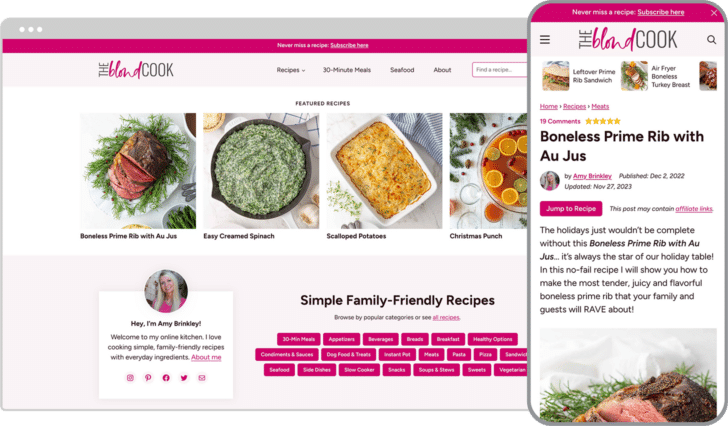
“Without a doubt, I would hire Ryan again. He was so easy to work with, very responsive throughout the process and really cared about my goals as a blogger. He listened to my feedback and I love how the full redesign of my food blog turned out!”

Julie Tran Deily
The Little Kitchen
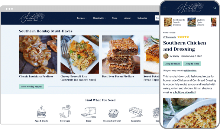
Latest Redesigns
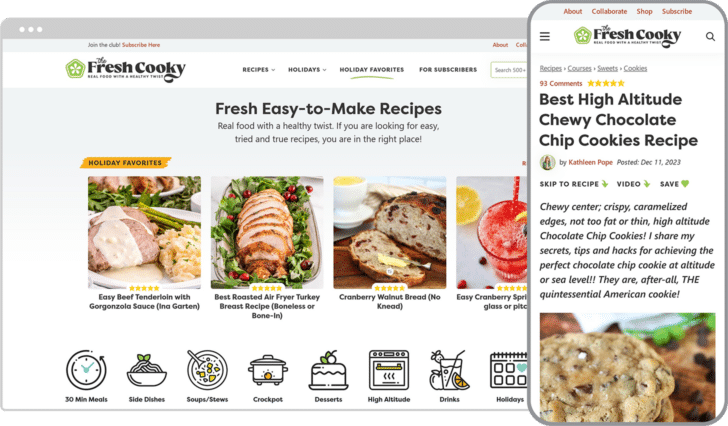
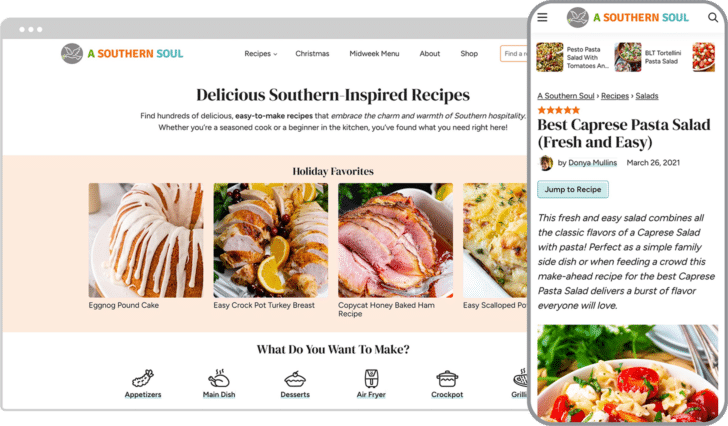

Site speed optimization at the core
Even when running ads, you can have a fast site that passes Google’s Core Web Vitals, an increasingly important ranking factor and critical for happy users.
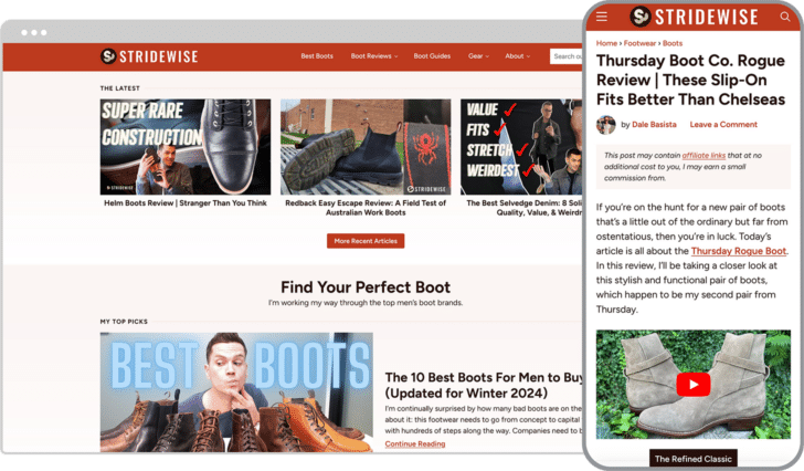
“Built for speed! I tasked Ryan with building a fast site and he delivered. My old site scored a pitiful 24/100 on mobile. The new site scores about 96 on mobile and 100 on desktop. Thank you, Ryan, for making this possible.”

Andrew Allemann
Domain Name Wire
Support & maintenance
Hands-on proactive maintenance and personal friendly support for your WordPress website. Complete peace of mind that you have an experienced professional looking after your site and available when things come up.
“Ryan has been an absolute joy to work with. He is fast to resolve any tech issues that come up on my site and is always looking for ways to better my pagespeed. He listens to my goals for my business and website and executes with ease, always exceeding my expectations!“

Lindsay Cotter
Cotter Crunch